Electronic Arts
- Visual Identity
- Design System
- Style Guide
A Bold Update for A Heritage Brand

Electronic Arts, a gaming mainstay, needed a new look that nods to its legacy.
As the gaming and entertainment category has matured and fans look for direct relationships with the brands they pay attention to, Electronic Arts needed tools to show up coherently across multiple platforms, while signaling their vibrant culture of art and innovation, and demonstrating the breadth of their offerings. We offered a dynamic, colorful system that celebrates the full spectrum and yet still harkens back to classic elements of the existing brand.
The Building Blocks
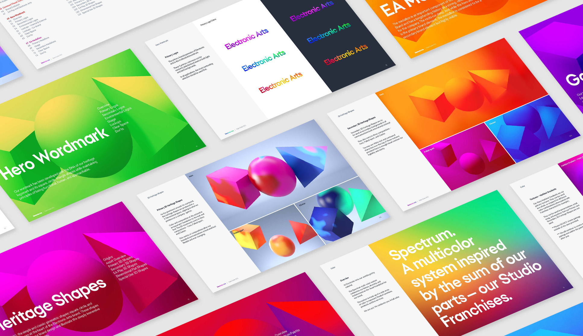
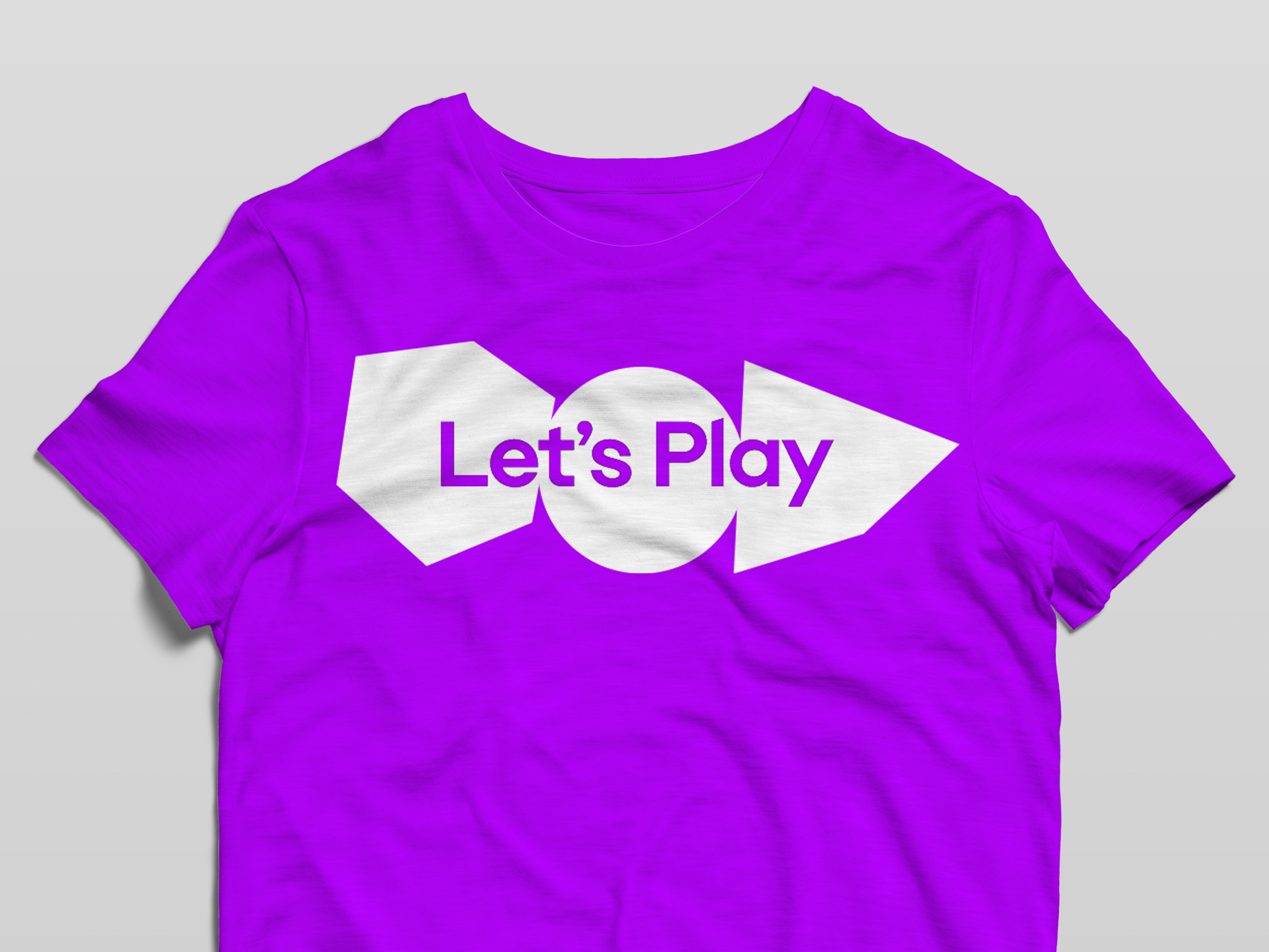
Electronic Arts is built upon innovation and creativity. This heritage informed the creation of a fresh wordmark incorporating the three primary shapes of the original logo – cube, pyramid, and sphere, which illustrate the immersive 3D spaces we play in everyday. The heritage shapes became the building blocks for the new visual language.
Immersed and Unified in Color
This approach was then expanded into a hardworking unified system that flexes across all aspects and expressions of the brand — from custom typefaces to a brand identity and broadcast tools.
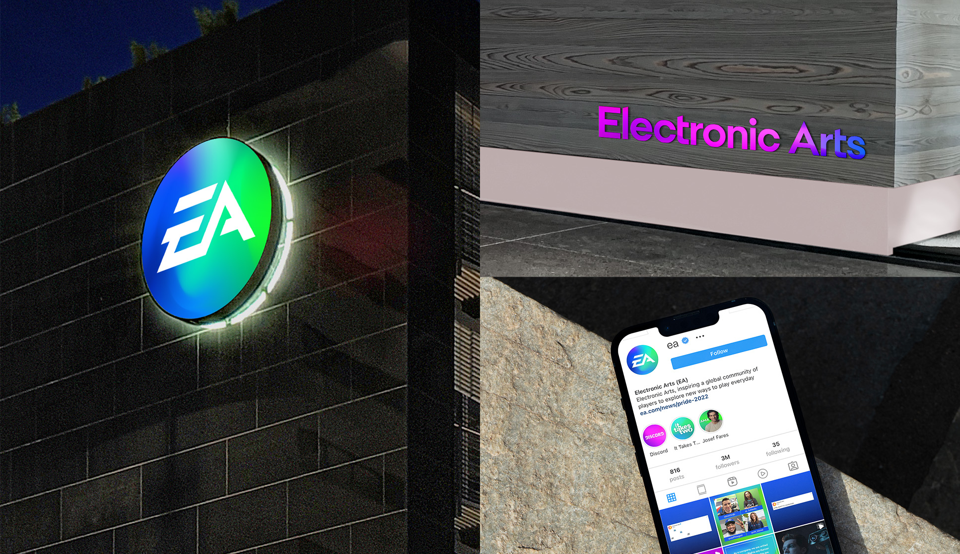
Infused with playful, immersive color, this system provides distinction and support for Games, Studios, and Services through a consistent hero brand.
A Fresh Typeface
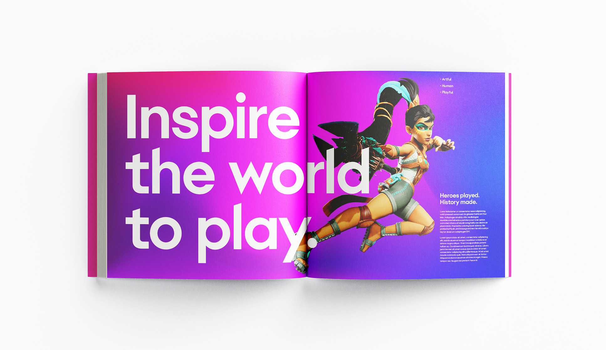
Using the cube, pyramid, and sphere geometries as a starting point, we collaborated with the Electronic Arts brand team and type designer Jeremy Mickel to create a custom geometric sans typeface that was uniquely Electronic Arts.
The Entire Spectrum
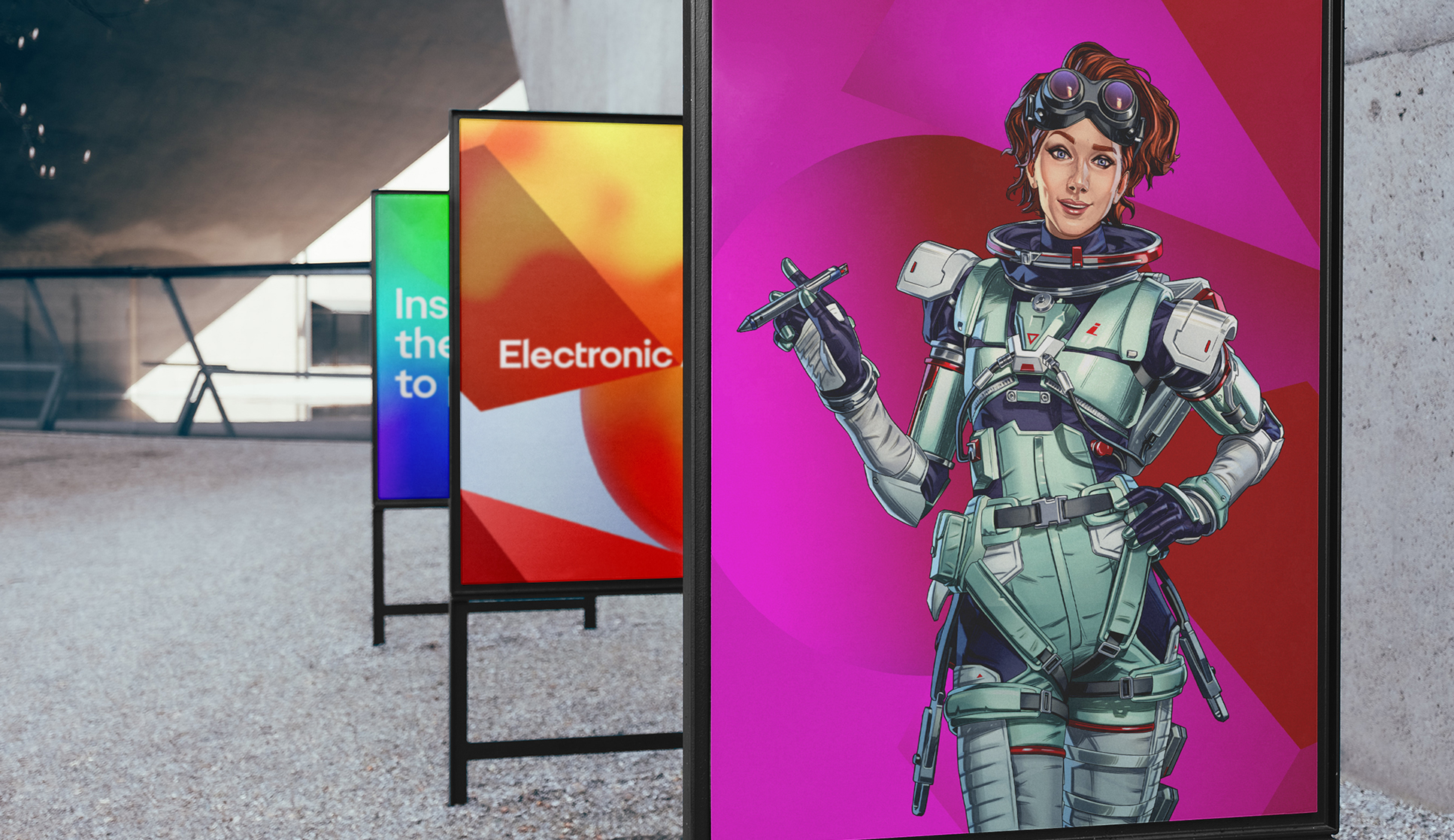
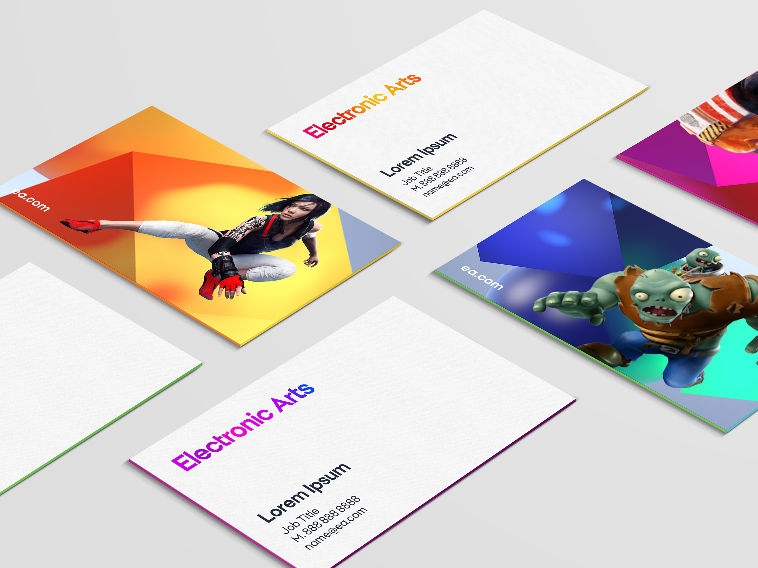
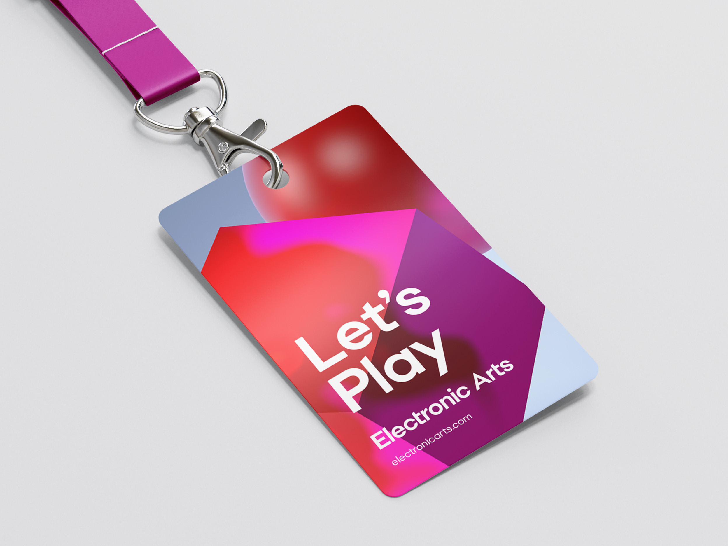
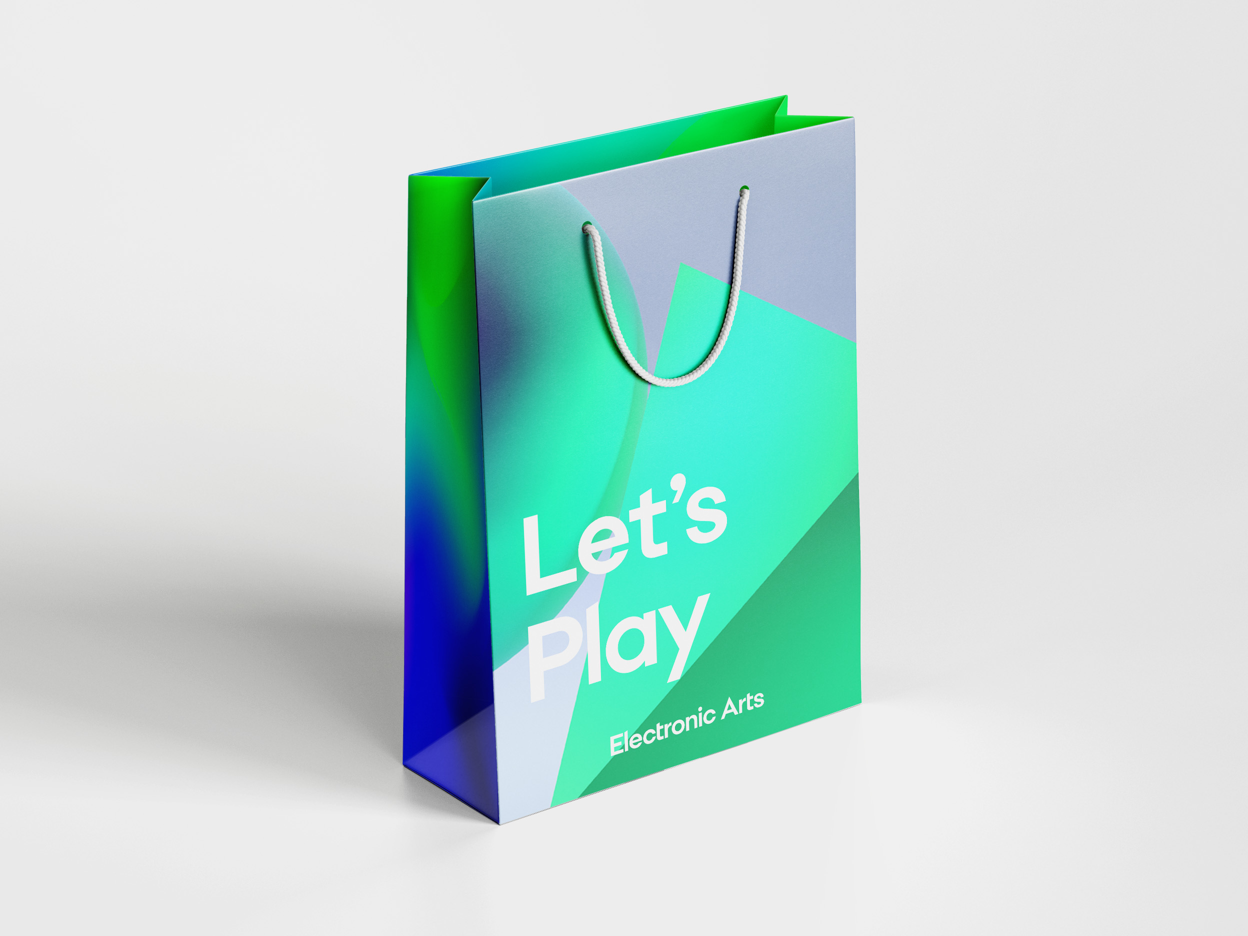
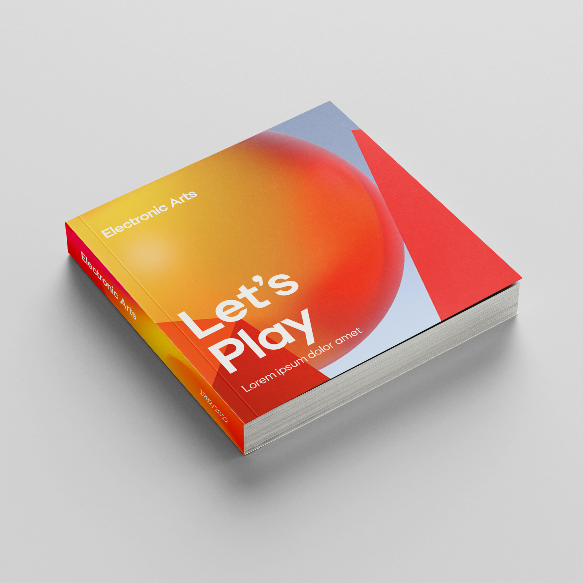
The brand system is inspired by the sum of all of EA’s parts, from Games to Studios to Events to Products, and so uses the entire color spectrum. Our heritage shapes bounce playfully across compositions and appear in all shades and tones. To ensure a cohesive brand across all touchpoints, we created an extensive suite of assets and robust guidelines to accompany them.
