Xbox & Obsidian Entertainment
- Creative Strategy Development
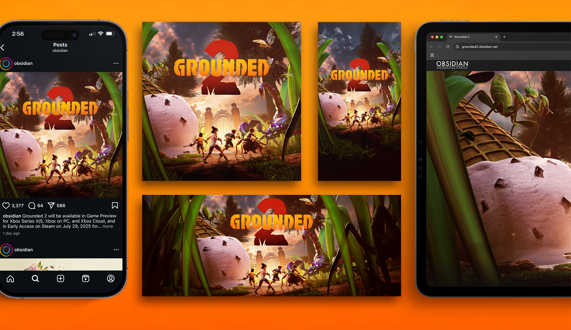
- Key Art
- Logo Design
- Tagline & Manifesto
- Production
Bigger, Badder, and More Fun Than Ever
A Tremendous Creative Trifecta
Xbox Game Studios and Obsidian Entertainment are the makers of some of the greatest RPGs on the planet, and all of us at Skylight just happen to be huge fans! Over the years we’ve built a deep partnership with Obsidian, and have been lucky to work on a number of amazing titles with them. Now, Skylight has stepped into the park to tackle one of our biggest little creative challenges yet…Grounded 2!
Starting in Our Own Back Yard
The original Grounded officially launched in the Fall of 2022, after two years in early access. Players were immediately hooked by its bright, beautiful world, its lovable cast of kids, and its retro ‘80s and ‘90s vibes. So, when we started working on a brand identity for Grounded 2, our goal was to start with the foundation the first game established, and build onto it with something bigger, badder, and more fun than ever before.
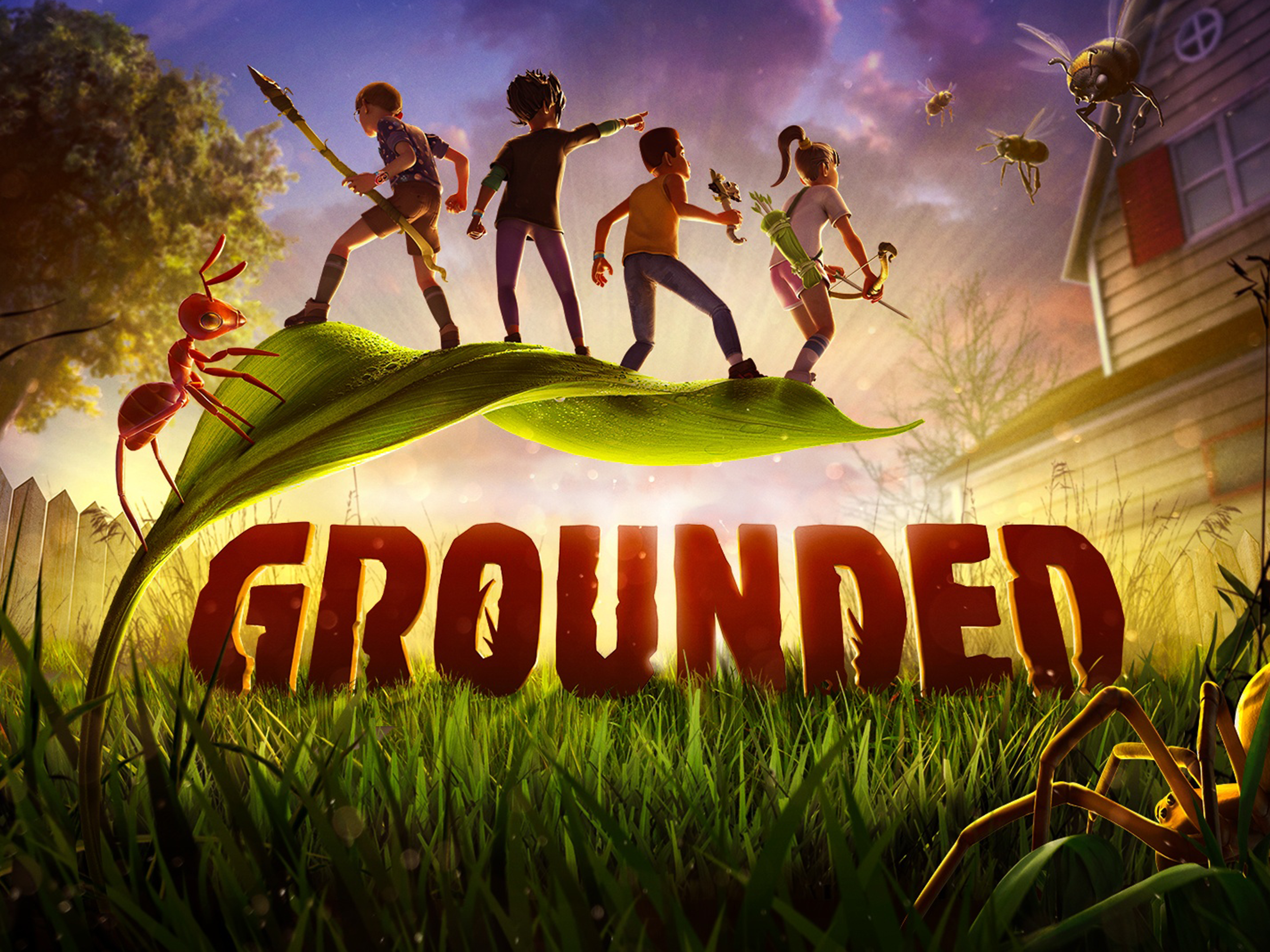
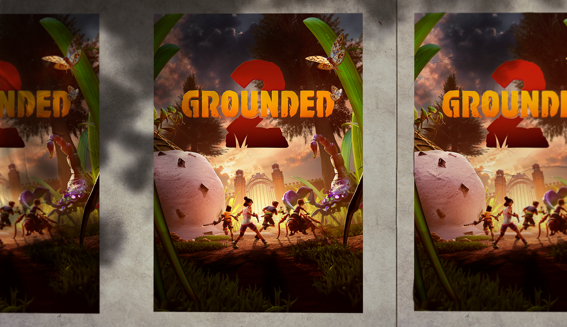
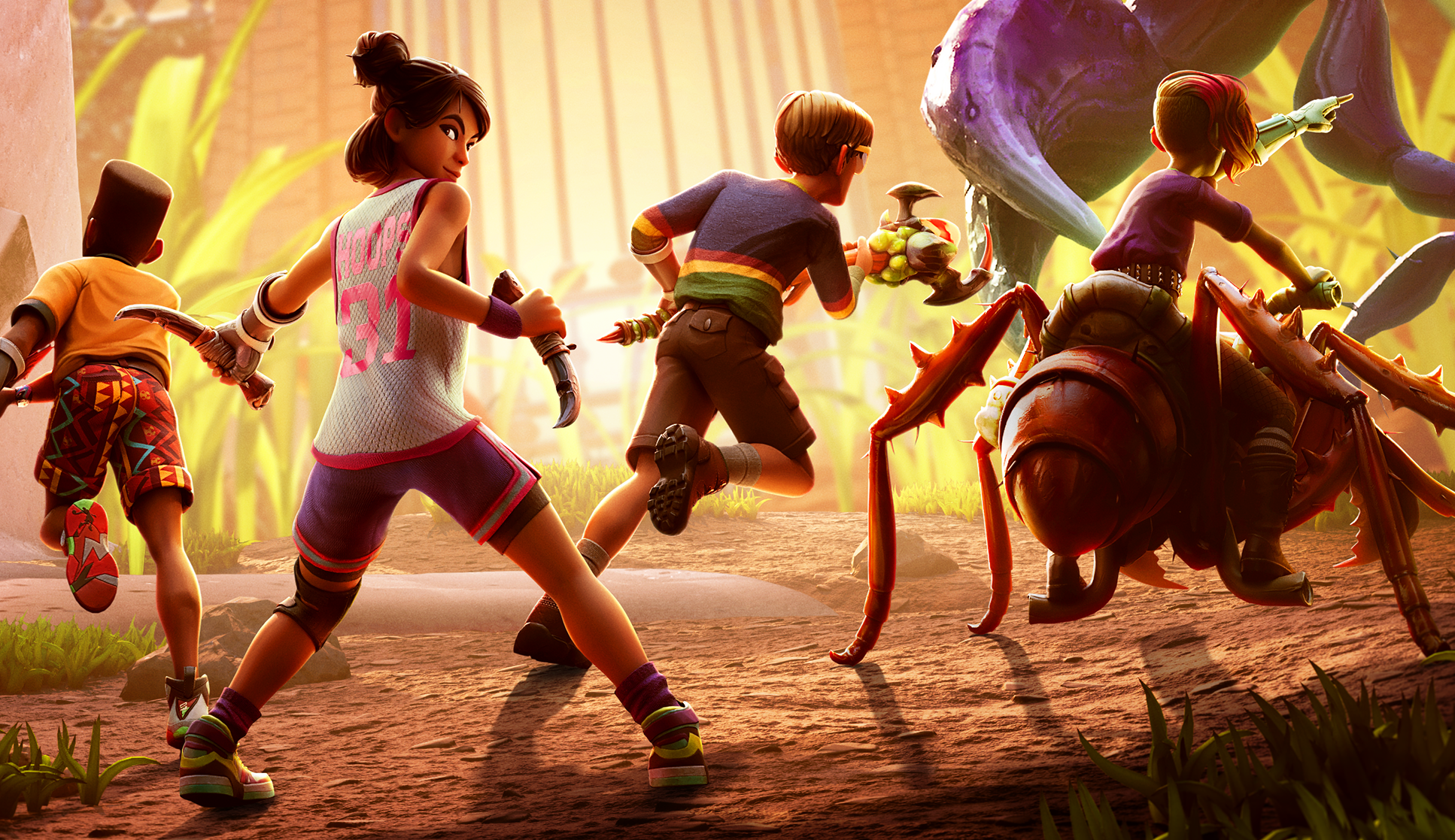
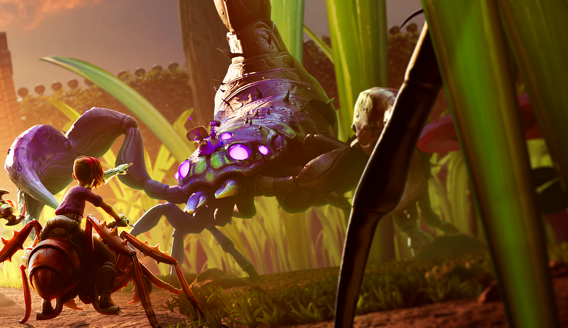
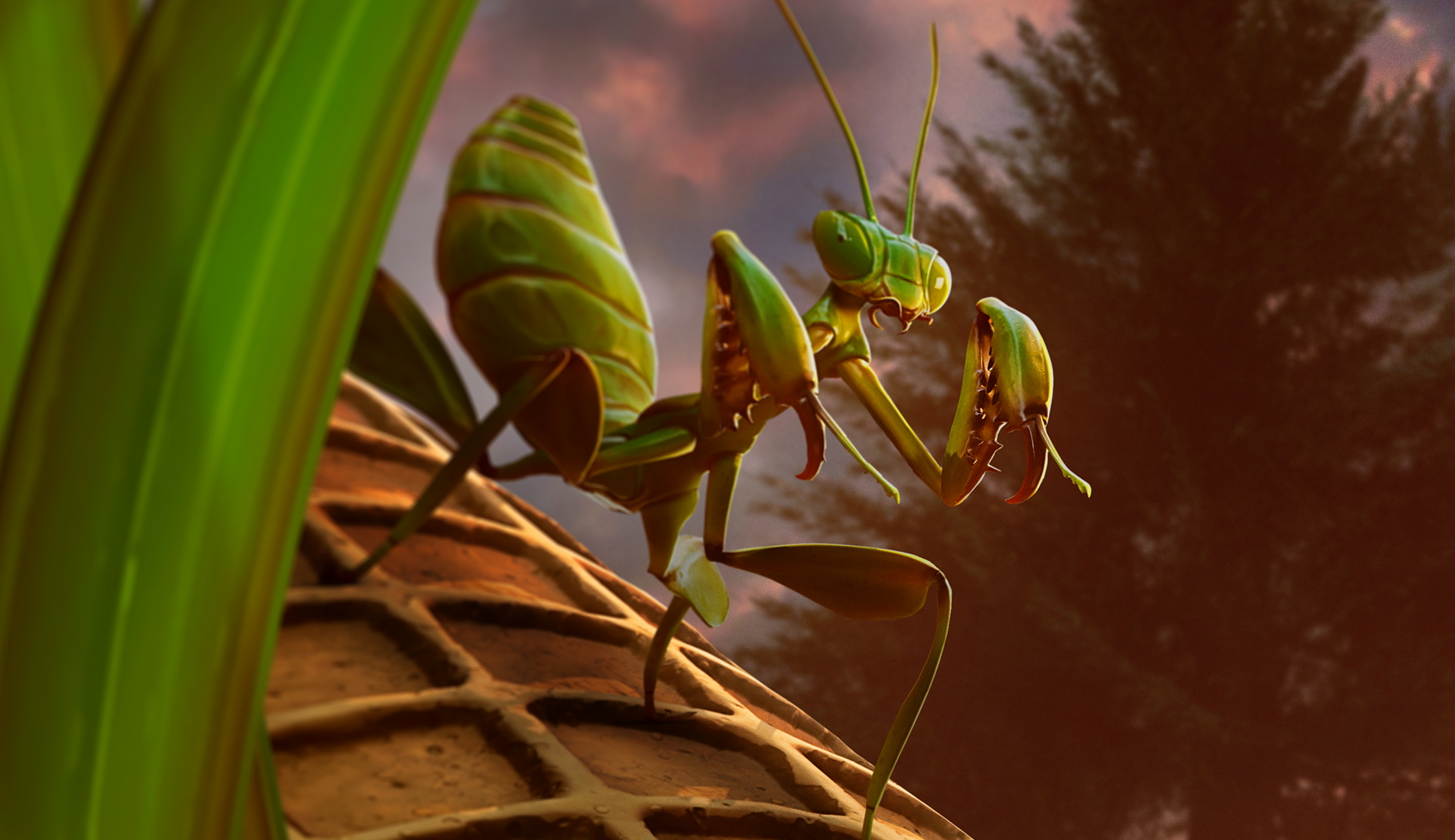
Two years after the events of the first Grounded, our heroes are back in action. And this time they’re older, more grown-up and ready for new challenges. As we explored composition, posing, and actions for our group of aged-up heroes, we needed to make sure their confidence and capabilities came through loud and clear to indicate that they’ve moved beyond being scared kids in the backyard. The new and more serious threats they face in a larger, more dangerous park needed to shine through as well.
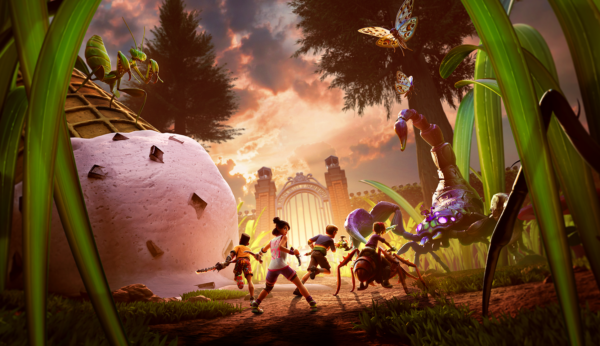
As we worked through the development of our hero key art for Grounded 2, we looked at compositional and thematic elements we could take from the first game to inform our work. Ultimately, we focused our energy on four key things throughout our explorations that would keep this new identity work rooted in our history, while moving us forward: aging up our heroes, dialing up the danger, focusing on the buggies, and highlighting the bigger park environment.
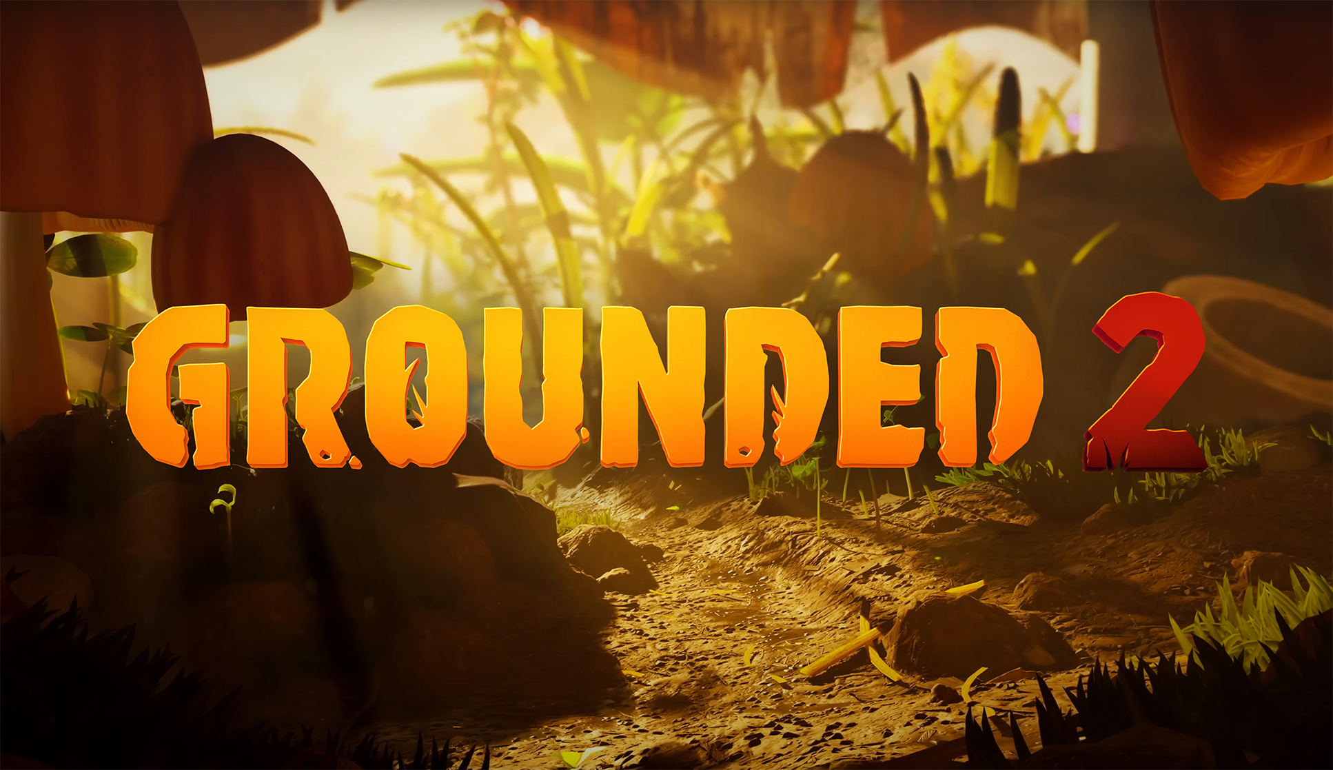
In addition to the hero art, our team was able to develop a new and improved brand mark as well. We leaned into the core design DNA that made the original Grounded logo so compelling, and focused on fine-tuning and refinement for the core wordmark, as well as an exploration of how we best bring the notion of “2” into the identity. In the end, we were able to craft a hard-working, very legible brand ID that is a beautiful element in the key art, and a powerful standalone visual when used without the art.