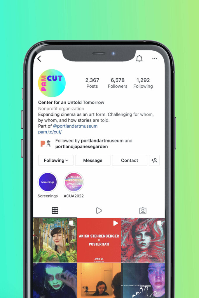
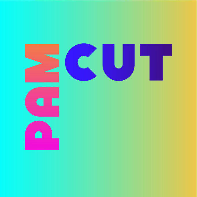
PAM CUT
- Consumer Insights
- Naming
- Visual Identity
- Design System
Reimagining a Portland Institution
The Process
It was time, the former Northwest Film Center told us. To shake things up. To reimagine.
In 2021, in a rapidly evolving cultural context, The Portland Art Museum’s 51-year-old Film Center had a fresh vision: to radically expand how it serves unbound, multidisciplinary artists and storytellers and audiences locally and globally. We were thrilled to collaborate on defining a fresh name and visual identity that could speak to this bold purpose, and align more closely with the Museum, of which it is an integral part.
Fit to Meet the Future
Using stakeholder interviews and workshops alongside our own research, we analyzed the competitive landscape, evaluated emergent trends, and identified priorities and goals for the organization. With these learnings, we explored an array of naming options along a spectrum from traditional to far out. With a more narrow field, we went back to the community to find the fan (and Museum and film center) favorite: PAM CUT // Center for An Untold Tomorrow.
“PAM CUT represents an important way forward where visitors, members, artists and community partners can experience not only the traditional moving image, but also a wide range of storytelling experiences and opportunities that challenge the traditional boundaries of the film medium.”
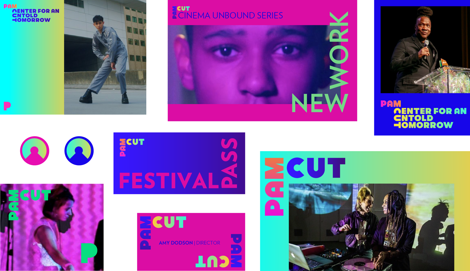
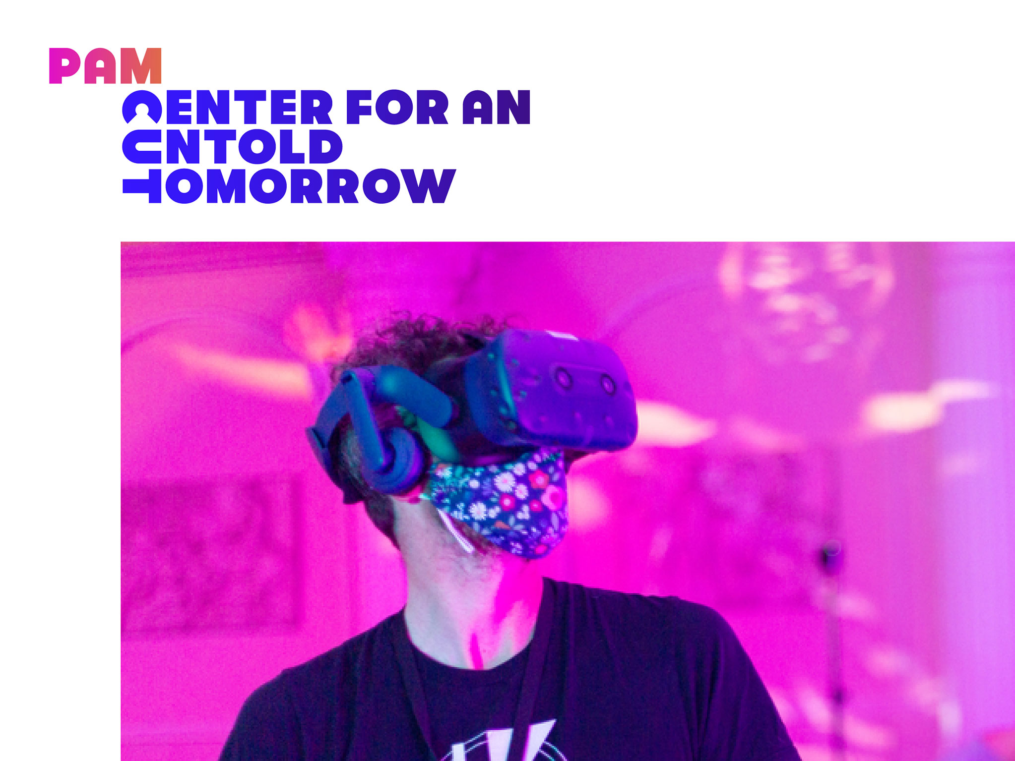
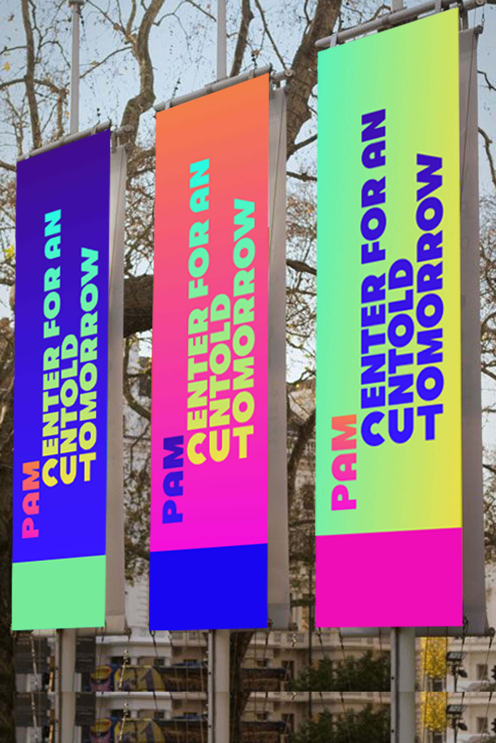
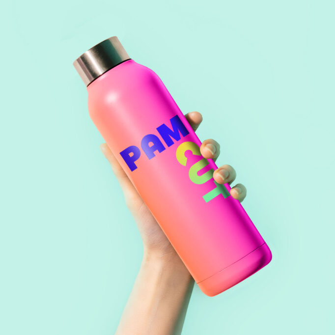
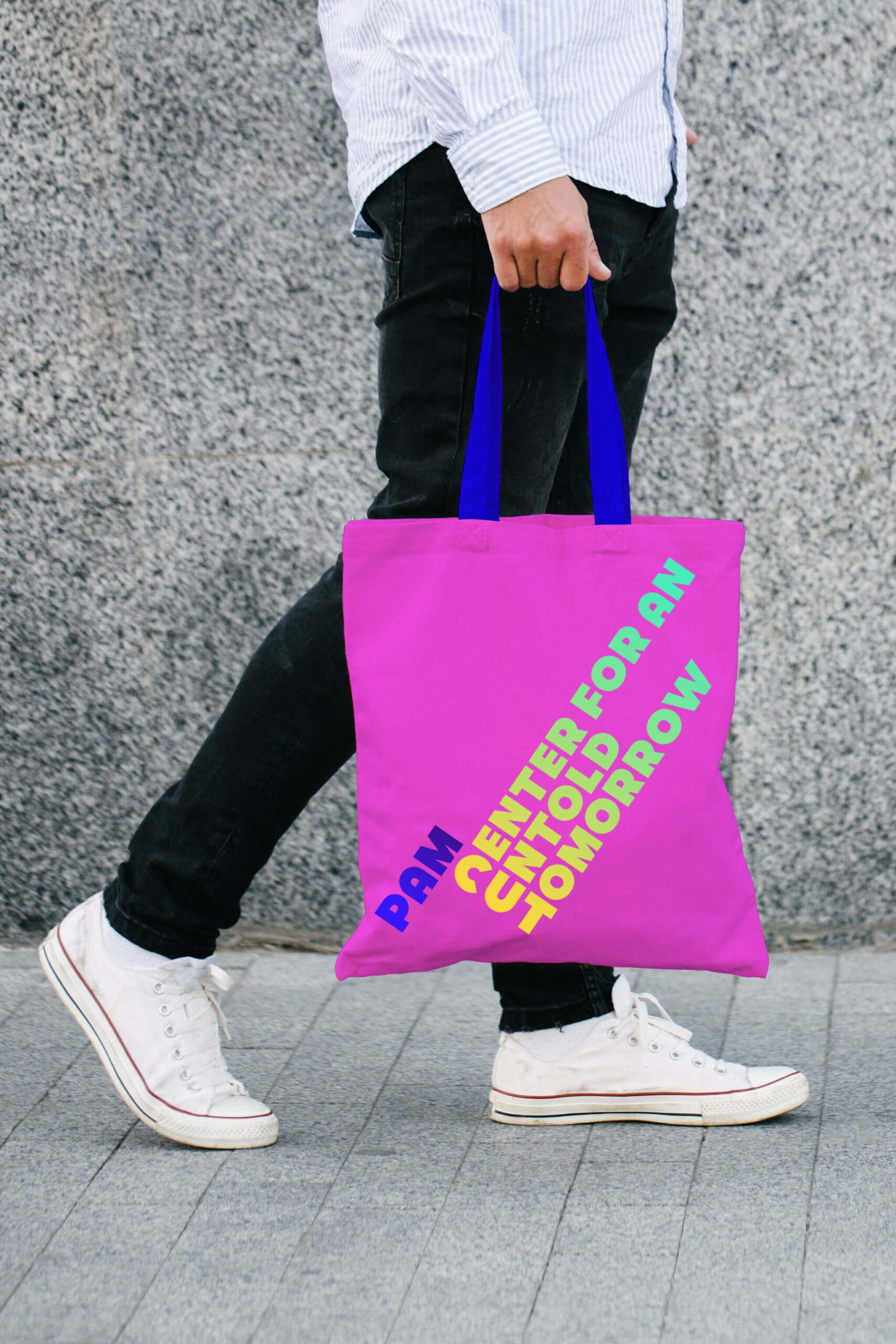
A unique identity for now and tomorrow
Looking at the competitive landscape for both traditional arts and cultural institutions as well as innovative experiences, we quickly determined our target. We needed to capture the spirit, attitude and energy of the best party you’ve ever been to, while also delivering a visual identity that was hard working, highly accessible, and approachable.
Easily readable, energetic and playful, we began with clean geometric sans type solution as our foundation, and leveraged a fresh color palette, inspired by electricity and light shows, to signal the organization’s shift towards a more experiential brand (vs. an institutional one).
PAM CUT is a place, a space, and a state of mind that welcomes those who aren’t content to be contained.
A New Perspective
We used heavy, friendly geometries as well as some unifying “rounded” forms in the primary PAM CUT mark, then rotated the letters of CUT. This new perspective purposefully communicates the organization’s bold creative intitions to deliver creatively unbound experiences. It also helps CUT stand on their own, as a first read and it asks the audience to turn their heads to see something in a new way. These then become the corners of a viewfinder, helping us frame up our vision.
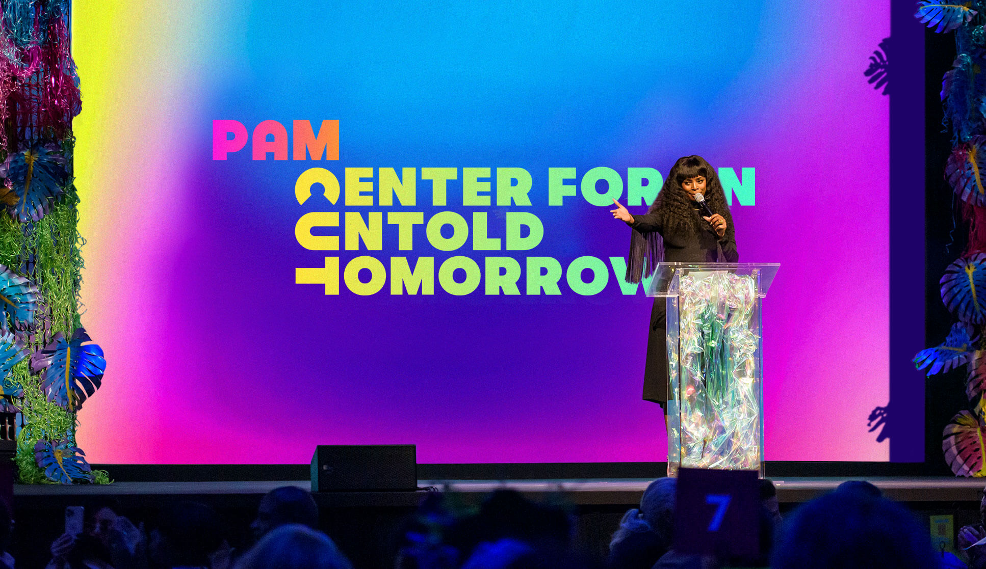
Unveiling at the Cinema Unbound Awards
The new name and identity were announced at the Portland Art Museum’s third annual Cinema Unbound Awards, sharing the stage with Will Smith, Jeff Goldblum, and Carrie Brownstein. The colorful and energetic awards show mirrored PAM CUT’s new vision and identity, turning the camera toward a wide and bright future.